Monthly Archives: February 2010
QuickiePic:3rd Avenue Bridge & Minneapolis Skyline
Post-Processing: Tilt-Shift Effect
Shot my friend’s engagement last weekend. Finally getting around to post processing the batch of photos (while watching Strikeforce on Showtime right now… who says dudes can’t multitask?!).
The weather was nice for the first part of it; being winter in Minnesota, whenever the sun comes out, we consider that nice (even though it was still below freezing). It got pretty cold out, once the sun started to go down, so even though I had all these great plans, I ran into some issues with my batteries in my flash triggers not working very well in the cold (not to mention how miserable my friends Matt & Melanie were in the frigid cold). We scrambled over some rough and icy terrain making our trip a little bit of an adventure, but for the most part, we got some good shots. I definitely am still learning every time I go out though.
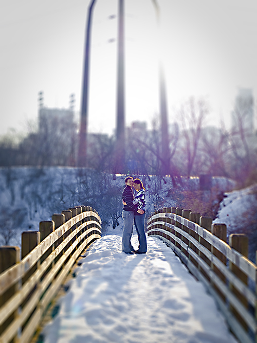
So here’s a shot from that outing:
Some people are satisfied with the JPEGs they get straight out of the camera; I shoot in raw though. Basically, the difference is, the raw format (which is different for each brand of camera) is an uncompressed image comparable to film negative from back in the day, and JPEGs are the compressed version. Raw gives you more latitude to manually adjust some settings afterwards(white balance, exposure, levels, sharpness, etc), giving you the flexibility to enhance your image during post processing (I use Adobe Lightroom 2 or Adobe Camera Raw), similar to what photographers did in the darkroom back in the days of film, albeit a lot easier. JPEGs lock in these settings in camera, and save a compressed version of the image; making the image require less hard drive space, but getting rid of a lot of the image information that the raw format keeps and allows you to adjust.
For the photos I’m posted below, I did the basic adjustments to the exposure, levels, and sharpness, but to get the tilt shift effect, I boosted the saturation/vibrance and followed the tutorial at: http://www.tiltshiftphotography.net/photoshop-tutorial.php
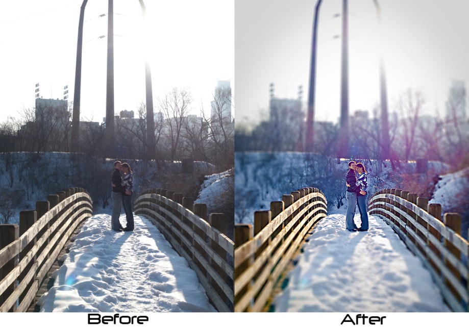
When I took the image, it was shot into the sun, which reduced the amount of sharpness in the photo, and it was underexposed due to the shadows the light cast. Obviously, if I had properly exposed it in camera, I’d be able to shoot in JPEG and not worry about shooting raw. But, when I get to that level, I wouldn’t have to keep writing this blog with my lessons learned ;).
Overall, I like the the tilt-shift effect. It really works better for shots with angles taken from higher above, but I think it worked out okay for this one. In any case, here’s the before and after of the photo (the after is shown above, but here it is side by side).
Alright, I guess I gotta get back to more post-processing and watching of grown men beating each other up!
Some Thoughts on Composition…
Here’s a photo I took this past weekend while in NYC visiting some friends…
I really like this photo. Granted, I did take it, but compositionally, as well.
Here’s why I like it:
1. Rule of Thirds. The rule of thirds isn’t a rule so much, as it is a guideline. Basically, the gist is that the subject of a photo shouldn’t have to be in the center of the photo. If you drew a grid, splitting the frame into thirds, vertically and horizontally, the subject should lie somewhere along those lines, or at the intersection of those lines. I think I could have done a little better shifting the frame to the left to align the subjects on the thirds. But, if I did it perfect, maybe it wouldn’t be as interesting.
2. Foreground/Background. The 2 subjects make up the Foreground (Patty) and the Background (Pat). It adds more to the photo having the viewers eye scan the photo between the foreground and background. Patty, being closer, in the foreground, draws more attention, while Pat, being in the background, doesn’t draw as much attention. However, as he is looking directly at the camera, and Patty is looking away, it shifts the attention to him, creating a nice tug of war with the the viewers attention. Also, the line from the window frame creates a nice separation of the foreground from the background.
3. Treatment. The photo isn’t a portrait. It’s more or less a candid shot, which does well with a black&white/desaturated color treatment; reminiscent of a snapshot in time, a moment frozen and plucked from a the slideshow of my life. This was done in post processing; adjusted curves, contrast, saturation, and cropping.
In no way am I saying that I planned any of this beforehand; but there is a beauty in unposed, candid shots. And considering that the subjects in the photo are both my friends, it makes the photo all the more interesting for me; so it just works. Photos don’t need to be analyzed in this way to make sense; sometimes photos just work, whether or not they follow any sort of guidelines.
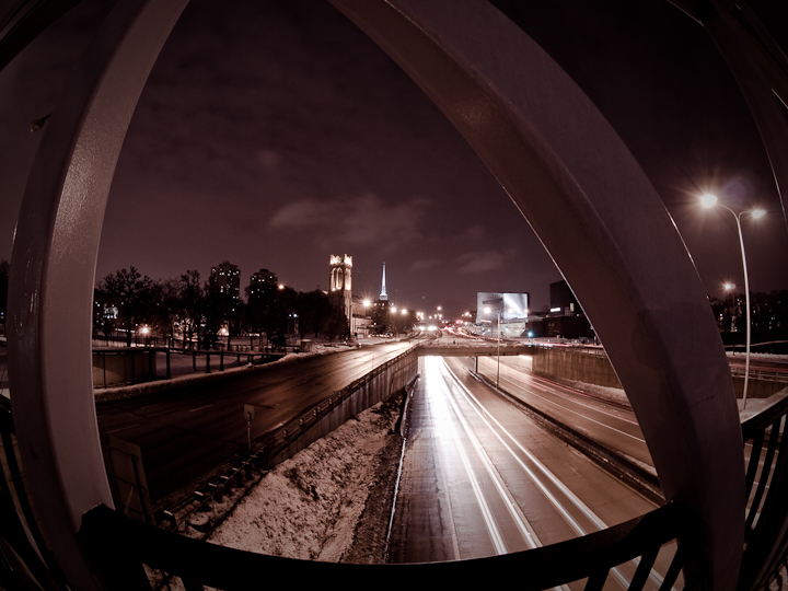
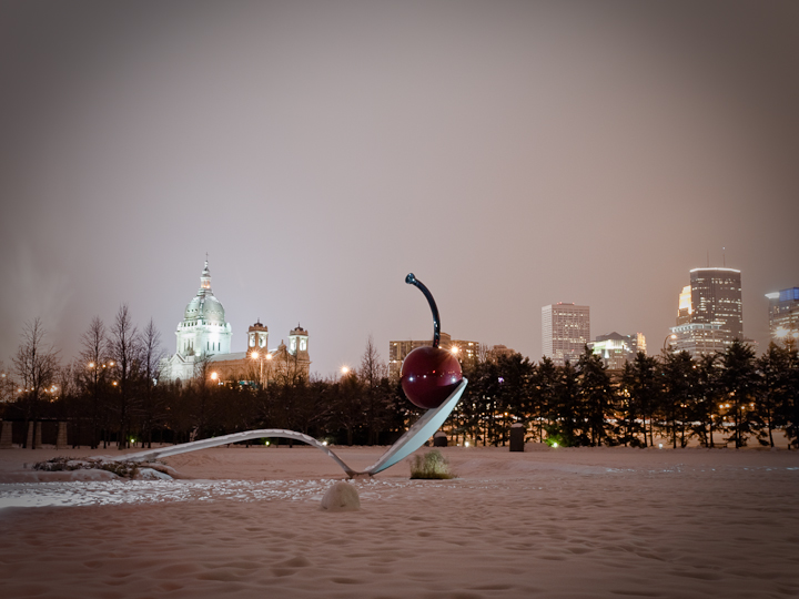
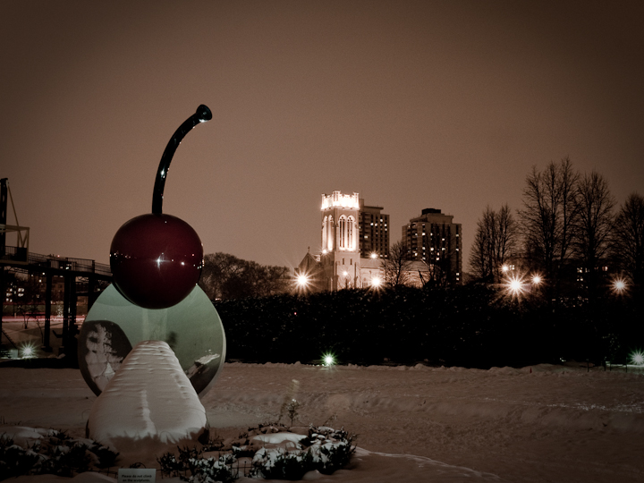
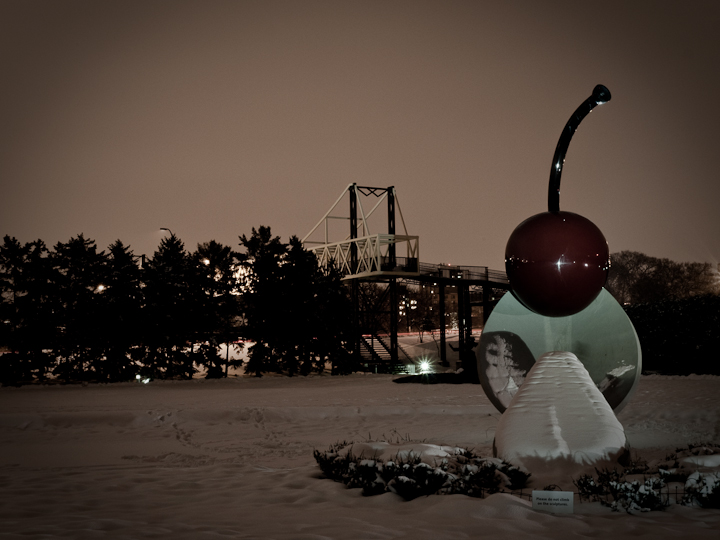
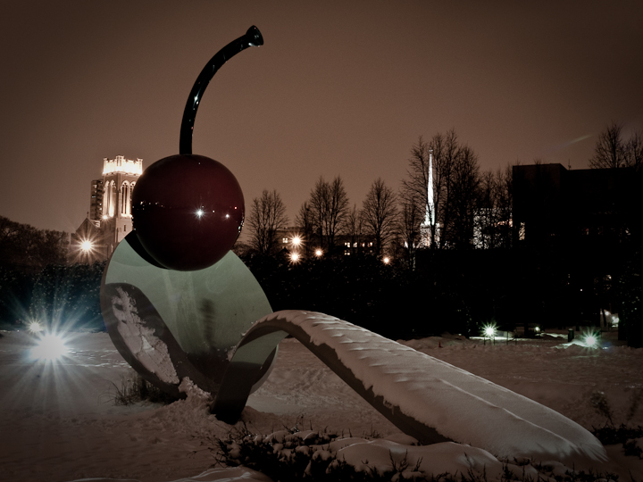
Sandy a la Mode – Assignment #2: Night Photography
Sandy’s second photography “assignment” was about night photos…
http://www.sandyalamode.com/2010/02/01/dark-skies/
It’s a good thing I decided that I’d undertake her photography blogs as a reason to get out and shoot. It’s nice to have a focus/purpose when going out to take photos; just try not to get that tunnel vision and overlook any other photo opportunities should they come up during that time.
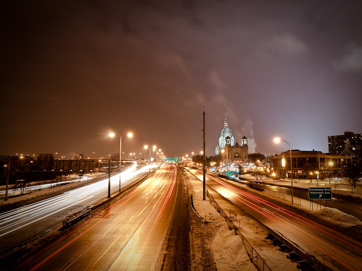
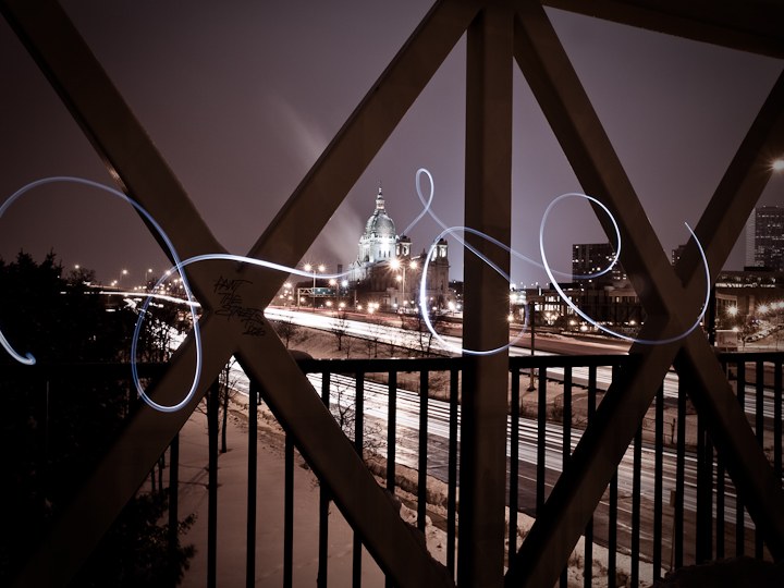
In any case, I took the opportunity to grab my camera (Olympus E620) and a couple lenses (Olympus ZD 12-60mm f/2.8-4.5 and the Olympus ZD 8mm Fisheye), along with the tripod my pops gave me (when he upgraded to a nice carbon fiber one, and a steel one… he’s more of a photo gearhead than I am.) The following photos are taken from areas within walking distance from my apartment. The photos were taken near the Loring Park area, with shots taken from a pedestrian bridge, or from within the Walker Art Center Sculpture Garden.
1.
3.
10.


